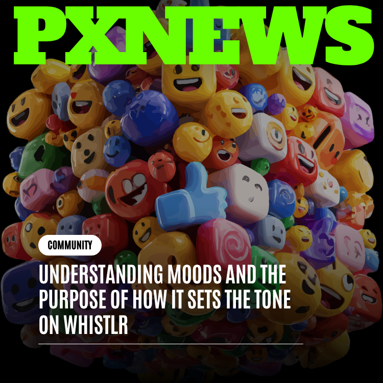
For fifteen years, the like button has been the single most-tapped control in social media, and for almost as long it has been quietly failing the people who rely on it. Today ETAPX is taking a deliberate, design-led look at the most familiar gesture on Whistlr — the like and reactions button — and rebuilding it from the psychology outward. This is the story of why a one-tap heart was never enough, how a richer set of reactions creates healthier signals for creators and ranking, and the careful design and accessibility decisions behind the change.
The like button is deceptively simple. It is one icon, one tap, one binary state: liked or not liked. That simplicity is exactly why it became the connective tissue of the modern internet — a universal, frictionless way to say "I saw this, and I felt something." But simplicity has a cost. A single button can only carry a single meaning, and human feeling is not single. When the only tool you hand someone is a heart, every reaction gets flattened into the same shape, whether the post made them laugh until they cried, broke their heart, taught them something, or simply scrolled by pleasantly. On Whistlr, posts are called whistles, and we kept asking ourselves a hard question: were we really hearing what people wanted to say about them?
This article walks through the full redesign — the behavioral research that motivated it, the engineering that powers it, the design tradeoffs we wrestled with, and what it means for the creators and communities that make Whistlr worth opening. It is a long read, because the most-tapped button on the platform deserves more than a changelog entry.
Why Redesign the Like Button Now
There is a fair question lurking here: if the like button has worked well enough for fifteen years, why touch it at all? The honest answer is that "well enough" was never the same as "well," and the gap has widened as social platforms matured into the central places people share their lives. A control that was acceptable when the internet was a novelty becomes inadequate when it is the venue for grief, celebration, learning, and friendship all at once.
Whistlr is built as a friend-first, creator-friendly alternative to legacy social networks, and that positioning raises the bar for something as fundamental as feedback. A network organized around real relationships cannot ask people to translate every feeling into a heart and call it connection. The mismatch that legacy platforms tolerated — between the richness of what people feel and the poverty of how they can express it — is exactly the kind of inherited compromise a next-generation platform exists to fix. Redesigning the most-tapped button is not a vanity project; it is one of the clearest places to make the friend-first promise concrete.
Timing mattered too. The reactions vocabulary already existed across Whistlr's messaging and discovery surfaces, the real-time infrastructure to support live counts was already in production, and the offline resilience patterns were already battle-tested on the swipe-to-react experience. The redesign was less about inventing new machinery than about bringing a capability the rest of the platform already had to the one surface that needed it most.
The Like Button's Quiet Tyranny
To understand why we redesigned the like, you have to appreciate how much weight a single button was carrying. On the old Whistlr feed, the heart at the bottom of every whistle did at least four jobs at once. It told the author someone appreciated their post. It told other viewers the post was worth attention. It told our ranking systems the content was good. And it gave the person tapping it a small, satisfying release — a way to participate without composing a reply.
Those four jobs pull in different directions. The author wants nuance: did people find it funny, moving, useful, or surprising? The ranking system wants a clean, comparable signal it can trust. The viewer wants speed. And the tapper wants their feeling to be represented honestly. A lone heart cannot satisfy all four, so it compromises all four. It became, in our internal shorthand, a "lossy" signal — a feeling compressed down to a single bit and never fully recovered on the other side.
"The like button was the most successful piece of interface design of its era, and also the most overloaded. We weren't trying to kill the like. We were trying to give it the vocabulary it always lacked."
— ETAPX Product Team
There is a deeper problem too. When the only way to engage cheaply is to like, people like things they don't actually like. They tap the heart on a friend's sad news because there is no better option, then immediately feel the wrongness of it. A heart on a post about loss is a small daily act of mistranslation. Multiply that across millions of interactions and you get a feed where the data and the human reality have drifted apart. The numbers say "loved," the moment says "I'm so sorry." We wanted the gesture and the feeling to finally agree.
The Old Way Versus the New Way
It helps to put the two side by side, because the difference is not cosmetic — it is a difference in what the platform can know and what people can say. The old like button and the redesigned reactions button look superficially similar, but they answer fundamentally different questions.
The old like answered one question: did someone tap? That binary fact had to stand in for every shade of human response, and the platform built everything — author feedback, social proof, ranking — on top of that single bit. The redesigned button answers a richer question: how did people respond? A tap still works for the simple case, but the system can now distinguish delight from sympathy, agreement from awe, amusement from admiration.
The practical contrasts are worth spelling out:
- Old: One state, liked or not. New: A spectrum of named feelings, with the like preserved as the default.
- Old: A heart on a friend's bad news felt wrong, so people often did nothing. New: Sympathy and solidarity are first-class options, so people respond instead of going silent.
- Old: Creators saw a number and guessed at its meaning. New: Creators see a breakdown that tells them how a whistle actually landed.
- Old: Ranking treated all approval identically. New: Ranking reads the richer, more deliberate signal a reaction represents.
- Old: A single icon set the emotional tone of the whole platform. New: A curated, warm palette teaches a fuller and kinder range of response.
The redesign is not a replacement so much as a widening. Everything the old button did, the new one still does; it simply stops forcing every feeling through the same narrow opening.
What the Research Told Us About Feedback
Feedback is not a feature; it is a fundamental human need, and the psychology behind it is older than any app. People are wired to seek acknowledgment for what they share. When you tell a story at dinner and someone laughs, nods, or leans in, you receive an immediate, specific signal that your contribution landed and how it landed. That specificity is the point. "They laughed" and "they were moved" are different rewards, and they shape what you choose to share next in different ways.
Social platforms replaced the dinner table with the feed, but in doing so they collapsed the rich, multi-channel feedback of real conversation into a single counter. A creator could see that a whistle got two hundred likes, but not whether those likes meant delight, agreement, comfort, or mere acknowledgment. We came to think of this as a feedback bottleneck: enormous emotional bandwidth on the input side, a one-bit pipe in the middle, and a creator on the other end trying to reconstruct meaning from a number.
Three findings shaped the redesign:
- Specificity beats volume. In our conversations with creators, a handful of reactions that named a feeling — "that made me cry," "this is so real" — consistently meant more than a much larger pile of anonymous likes. Specific feedback is more motivating and more useful for deciding what to make next.
- Mismatch causes silence. When people couldn't find a reaction that fit, many did nothing at all rather than send the wrong one. The single like wasn't just flattening signal; it was suppressing it. People were withholding feedback because the available feedback was wrong.
- Tone is contagious. The reactions a platform offers quietly teach people how to behave. A button labeled with a heart invites affection; a richer palette invites a fuller, calmer, more human range of response — and, importantly, gives people a graceful way to acknowledge difficult posts without forcing false positivity.
None of this means the like is bad. It means the like is one note, and human feeling is a chord. The redesign keeps the note and adds the chord.
From One Tap to a Spectrum: The New Reactions
The redesigned button does something deliberately gentle: it behaves exactly like the old like for anyone who just wants to tap and move on, and it opens into a richer spectrum for anyone who wants to say more. A quick tap still registers a like — the same heart, the same instant red fill, the same familiar muscle memory. A press-and-hold (or hover, on the web) reveals the reaction palette, the same interaction pattern people already know from reacting to messages.
That palette is grounded in the reaction sets we already ship across Whistlr's messaging and discovery surfaces. In direct messages, the quick-reaction row is a tight, conversational set — heart, thumbs up, laughing, surprised, sad, and an appreciative clap or prayer-hands — the reactions people reach for most when responding to a friend. On the dedicated discovery surface, where people swipe through whistles one at a time, the palette widens to a fuller emotional range, including love, laughter, awe, fire, applause, and the more candid reactions people use among close friends. The redesigned post button draws from this same vocabulary so that reacting feels consistent wherever you are on Whistlr.
Why these reactions, and not a hundred emoji
A common temptation is to let people react with any emoji at all. We chose not to, for three reasons. First, a curated set is faster: a small, well-ordered row can be scanned and chosen in a fraction of a second, while an open emoji keyboard demands searching and thinking. Second, a curated set produces cleaner signal: when reactions are constrained to a meaningful handful, the data they generate is comparable and interpretable for creators and for ranking. An infinite palette produces an infinitely fragmented signal that means almost nothing in aggregate. Third, a curated set is kinder: a deliberately positive-leaning, non-sarcastic palette removes the most common vectors for pile-ons and passive aggression before they start.
The reactions were chosen to cover the genuine breadth of how people respond to a post — affection, humor, surprise, sympathy, enthusiasm, and admiration — while leaving out the tools people primarily use to be cruel. That is a values decision as much as a design one, and it is core to Whistlr's friend-first positioning.
"We treated the reaction palette like a vocabulary we were teaching the whole community. Every reaction we added or left out was a quiet statement about the kind of place we want Whistlr to be."
— ETAPX Engineering
How a Tap Becomes a Signal: The Engineering Underneath
The part of the button people see is a heart and a counter. The part that matters most is invisible: what happens in the milliseconds after a tap. Whistlr's web app is built on React and Next.js, the mobile apps on React Native for iOS and Android, and the backend on Supabase. The reactions system threads through all of them, and it is engineered around one principle — the interface should feel instant, and the data should be correct even when the network is not.
Optimistic updates so it never feels slow
When you tap the heart, the button fills red and the counter increments before the server has heard anything about it. This is an optimistic update: the app assumes success, reflects it immediately, and reconciles with the backend in the background. If the write to Supabase fails — a dropped connection, a momentary error — the app silently reverts the state and lets you know, rather than freezing the interface while it waits. The same pattern governs reactions: choose a reaction, see it land instantly, and trust the system to make it durable behind the scenes.
This matters more than it sounds. The like button is tapped more than any other control on the platform, often in rapid succession while scrolling. A fifty-millisecond delay multiplied across that volume is the difference between a feed that feels alive and one that feels like it is dragging. Optimism is not a shortcut here; it is a deliberate performance contract with the user.
Real-time counts that stay in sync
Reactions don't happen in isolation. While you are reading a whistle, other people are reacting to it too, and the count should reflect that without a manual refresh. Whistlr subscribes to live changes through Supabase Realtime: when a reaction is inserted or removed anywhere in the world, connected clients viewing that whistle update their counts in place. The effect is a feed that breathes — numbers tick upward as a post catches fire, in real time, the way a room gets louder as more people lean in.
Reactions that survive going offline
People use Whistlr on trains, in elevators, and in the dead zones between cell towers. A reaction tapped with no signal should not vanish. The mobile experience includes an offline action queue: when you react while disconnected, the action is stored locally and flushed to the backend automatically the moment connectivity returns. On the swipe-to-react discovery surface, this is taken even further — posts themselves are cached so the screen never goes blank, and pending reactions persist across app restarts until they sync. Your feelings are not lost just because your connection was.
- Tap or hold: A quick tap likes; a hold opens the reaction palette and you pick a feeling.
- Optimistic render: The interface updates instantly — fill, count, and animation — before any network round-trip.
- Persist or queue: The reaction writes to Supabase if you are online, or joins the offline queue if you are not.
- Broadcast: Supabase Realtime pushes the change to everyone currently viewing the same whistle.
- Reconcile: If anything failed, the app reverts cleanly and tells you, so the count you see is always honest.
Healthier Signals for Creators
For the people who make Whistlr worth opening, the redesign changes what the feed tells them about their work. A like count answers one question — how many people tapped — and leaves every interesting question unanswered. Reactions turn that flat number into a portrait.
Consider a creator who posts a short, vulnerable video about a setback. Under the old system, they would see a like count and be left to guess what it meant. Were people offering support, or just acknowledging the post? With reactions, the breakdown speaks plainly: a wave of sympathy and applause reads very differently from a wave of laughter, and the creator can respond to their audience as it actually is rather than as a number forces them to imagine it. The same post can now be understood, not just counted.
This has practical consequences for how creators work:
- Better creative decisions: Knowing whether a whistle landed as funny, moving, or informative tells a creator what to make more of — far more usefully than a like total ever could.
- Emotional safety in the numbers: A creator sharing something hard sees comfort and solidarity reflected back, instead of a heart count that feels eerily transactional next to difficult subject matter.
- Fairer comparison across posts: Two whistles with identical like counts might be doing completely different work. Reaction shape reveals which post sparked delight and which sparked deep resonance.
- Reduced pressure to chase one metric: When a single number stops being the only scoreboard, the incentive to optimize purely for likeability softens, and there is more room to post honestly.
None of this requires creators to do anything new. The richer data arrives automatically through Whistlr's analytics and Creator Studio surfaces, where reaction breakdowns sit alongside the other signals creators already use to understand their audience.
Richer Reactions, Smarter Ranking
The feed has to decide what to show you, and it makes that decision from signals. The most important thing to understand about Whistlr's approach is that not all engagement is weighted equally — and reactions sharpen the picture considerably.
Whistlr's real-time personalization gives different interactions different weight, reflecting how much effort and intent each one represents. A passive scroll-by is worth very little. A like is a baseline positive signal. A reaction carries more weight than a plain like, because choosing a specific feeling is a more deliberate, more informative act. A comment is worth more still, because writing takes real effort. And a share is weighted the most, because recommending something to others is the strongest endorsement a person can give. Watch time on video feeds into the same model, scaled to how long you actually stayed.
This tiered weighting is the quiet engine behind a healthier feed. Because a reaction is a richer signal than a bare like, it tells the ranking system more about what kind of content resonates with you and with the wider community — not just that something was approved of, but how. Over time, that lets the feed learn the texture of your taste rather than a single up-or-down verdict, and it lets genuinely resonant content rise on the strength of how people felt about it, not merely how many tapped a heart by reflex.
"A like tells us a post is good. A reaction tells us why. That 'why' is what lets us build a feed that feels like it actually knows you, instead of one that just counts heads."
— ETAPX Engineering
Crucially, this weighting is designed to reward resonance over manipulation. Cheap, reflexive engagement counts for less than considered engagement. A flood of low-effort taps moves the needle far less than a smaller number of people who reacted, commented, or shared. The result is a ranking system that is harder to game and more aligned with what people actually find meaningful.
The Design Decisions Behind the Button
A button that millions of people tap every day cannot be redesigned casually. Every pixel, every millisecond of animation, and every default carries enormous aggregate weight. Here are the decisions we agonized over, and why we landed where we did.
Tap stays sacred
The single most important rule of the redesign was that a quick tap must still just like. Hundreds of millions of muscle-memory taps depend on it. If reacting required a new gesture for the common case, we would have broken the most reliable interaction on the platform to serve a minority of moments. So the default is unchanged: tap to like, exactly as before. Reactions are an addition revealed by intent — a hold or a hover — never a tax on the simple case.
One red, everywhere
The liked state uses a single, specific red — the iOS system red, hex value FF3B30 — chosen so the heart looks identical across the React and Next.js web app and the React Native mobile apps. The heart icon itself is drawn from a shared vector path ported deliberately between platforms so that the curve of the heart, filled or outlined, is the same shape in your hand and in your browser. This is the kind of consistency users never consciously notice and would absolutely feel if it were missing.
Motion that confirms, not distracts
Reaction animations are tuned to confirm an action without stealing attention. A reaction pops in with a spring, scales up slightly on hover, and dips on press — small physical metaphors that make a digital tap feel tactile. On mobile, a light haptic pulse accompanies a completed reaction, giving the gesture a satisfying physical full-stop. The goal is feedback you feel for a fraction of a second and then forget, not a celebration that interrupts your scroll.
The counter that doesn't shout
We kept the count compact and quiet. Numbers are deliberately small and secondary to the icons, because the redesign is meant to nudge attention away from raw totals and toward the texture of response. The button should invite you to express something, not to fixate on a leaderboard.
Defaulting to kindness
Perhaps the most consequential design decision was what to leave out. By curating a reaction set that skews warm and excludes the tools of contempt, the button's very vocabulary steers the culture. You cannot react with a sneer if a sneer is not on the menu. Defaults are destiny at scale, and we chose defaults that make the easy thing the kind thing.
The Edge Cases We Had to Get Right
The simple cases are easy. The reason a most-tapped button is hard to redesign is the long tail of moments that don't fit the happy path, and a control used this many times will hit every one of them constantly. We spent a disproportionate amount of effort on the edges, because at this scale the edges are not rare — they happen millions of times a day.
Changing your mind
People react and then reconsider. Maybe you tapped the wrong feeling, or your read on a post shifted after the comments. Changing a reaction is treated as a first-class action, not a delete-and-redo: switching from one feeling to another is a single, clean transition, and the system records it as a change rather than pretending the first reaction never happened. Removing a reaction entirely returns you to a neutral state without leaving a phantom count behind.
Rapid-fire tapping
On a fast scroll, people double-tap, mis-tap, and tap again before the first action has even finished syncing. Because the interface updates optimistically and reconciles in the background, the visible state always reflects your latest intent, and the backend converges on the truth even when taps arrive faster than the network can answer. The count you see and the count stored never drift apart for long, and they never disagree in a way you would notice.
The same post in two places at once
A single whistle can appear in your feed, in a profile, in a detail view, and in someone's shared link, sometimes on two devices you own at the same time. Real-time synchronization keeps these views honest with one another: react on your phone and your open laptop tab reflects it, because both are subscribed to the same live stream of changes. The post is one thing, even when it is shown in many.
Reacting to difficult content
Some posts are heavy — loss, illness, hardship. The old heart turned these into awkward little transactions. The redesigned palette deliberately offers sympathy and solidarity so that acknowledging a hard post no longer means sending an inappropriate cheer. This is an edge case in the data sense and the most important case in the human sense, and it drove more of the palette decisions than any other single consideration.
Reactions, Communities, and Commerce
Because Whistlr is one platform rather than a bundle of separate apps, a change to the reactions button ripples outward into the parts of the experience that don't look like a feed at all. Two are worth calling out, because they show how a single well-designed control compounds across an ecosystem.
In communities, reactions change the texture of group life. A community thread where members can respond with the full range — laughing at the joke, applauding the win, sympathizing with the struggle — feels more like a room full of people than a wall of identical hearts. Reactions give a community its emotional weather, a quick read on the mood of a conversation that text counts alone could never provide. For the people who tend these spaces, reaction patterns are also a gentle health signal: a thread drawing warmth and laughter is doing something different from one drawing only silence.
In commerce, reactions become a softer, earlier form of intent than a purchase. When someone reacts with enthusiasm or admiration to a product whistle, that is a meaningful signal short of buying — a way for a community to surface what it genuinely loves, and for sellers to learn what resonates before a single transaction happens. A fire or a heart-eyes reaction on a drop is a small, honest vote, and in aggregate those votes tell a more useful story than raw like counts ever did about what people actually want.
The throughline is that expressiveness is not a feed feature bolted onto a social app. It is a primitive that makes every social surface — conversation, community, and commerce alike — a little more human.
Accessibility Was Not an Afterthought
A button this central has to work for everyone, and accessibility shaped the design from the first sketch rather than being bolted on at the end. The richer a control becomes, the more carefully it has to be built so that added expressiveness does not become added exclusion.
- Keyboard and focus support: On the web, the like and reaction controls are real, focusable buttons with visible focus rings, so they can be reached and operated entirely by keyboard, in logical order, without a mouse or touch.
- Screen reader clarity: The icons carry the right semantics and labels — the heart is hidden from assistive tech as decorative while the button announces its action and state ("Like" versus "Unlike") — so a screen reader user always knows what the control does and whether they have already reacted.
- Color is never the only signal: The liked state is communicated by a filled shape and a state change, not by color alone, so the distinction holds for people with color vision differences.
- Generous touch targets: Each reaction in the palette sits inside a comfortably sized circular target, spaced for imprecise taps, which helps people with motor differences and anyone reacting one-handed on the move.
- Respect for reduced motion: The spring and scale animations are tuned to be gentle and brief, in keeping with the platform's broader respect for users who prefer reduced motion.
- Forgiving interactions: Because the palette is a curated row rather than a tiny emoji grid, it is far easier to hit the reaction you meant — accessibility and speed turn out to be the same goal.
Expressiveness and accessibility are often framed as a tradeoff. We don't accept that framing. A well-designed reaction system gives more people more precise ways to be heard, including people the old single-target heart served poorly.
Reactions Across the Whole of Whistlr
The redesigned button does not live alone. Whistlr is a single platform with many surfaces — the personalized feed, short-form Minis, stories, live streaming, messaging, communities, and in-app commerce — and reactions are becoming a consistent language across all of them.
In direct messages, reactions have long let people respond to a friend without breaking the flow of conversation, the same press-to-react gesture now mirrored on posts. On the swipe-to-react discovery surface, where you move through whistles one card at a time, reacting is the primary act, complete with haptics and offline resilience. In live streaming, reactions give an audience a way to respond to a host in the moment, en masse, without flooding the chat. The redesigned post button completes the set, so that the gesture you learn in one place works everywhere you go.
This consistency compounds. A shared reaction vocabulary means the feedback you give is legible no matter the surface, the data creators receive is coherent across formats, and the ranking systems can reason about engagement uniformly whether it happened on a whistle, a Mini, or a live stream. One language, spoken everywhere.
A Friend-First Philosophy, Encoded in a Button
It is easy to talk about being friend-first in a mission statement and much harder to encode it in the interface people actually touch. The reactions button is where the philosophy stops being words and starts being behavior, because defaults at this scale are not neutral — they are the platform quietly telling everyone how to treat each other.
A platform that only lets you like teaches a culture of frictionless approval, where the path of least resistance is a reflexive tap and the only available verdict is positive. A platform that lets you react with any emoji, including the unkind ones, teaches a culture where contempt is one tap away. Whistlr chose a third path: a curated, warm palette that makes the easy thing the human thing. You can be moved, amused, surprised, or supportive in a single gesture — and you cannot be casually cruel, because the tools of casual cruelty were left off the menu on purpose.
This is the deepest reason the redesign matters. We did not just give people more buttons; we made a values choice about what kinds of response are easy and what kinds are not. The vocabulary of a platform shapes the conversations it hosts. By widening the vocabulary toward warmth and specificity and away from the flat, lossy, occasionally cruel options of the past, the reactions button does quiet, continuous work to make Whistlr feel like the kind of place you would actually want your friends to be.
"You can read a company's real values in its defaults, not its slogans. We wanted the default response on Whistlr to be specific, generous, and kind — because a button people tap a billion times is a culture, whether you design it on purpose or not."
— ETAPX Product Team
What Changes for You, the Person Tapping
Most people will experience this redesign as something that simply feels better without quite being able to say why. That is by design. Here is what actually changes in your day-to-day.
- If you only ever tapped the heart: Nothing breaks. Tap to like, exactly as before. The new powers are there if you want them and invisible if you don't.
- If a heart never quite fit: You finally have honest options. You can acknowledge a friend's hard news with sympathy instead of a heart that felt wrong, or tell a creator their video was funny rather than merely "liked."
- If you create: Your audience comes into focus. You see not just how many responded, but how they felt — and you can make your next thing knowing that.
- If you care about your feed: Your reactions teach the system the shape of your taste, so what you see gets quietly, steadily more like what you actually want.
The redesign asks almost nothing of you and gives back a feed and a community that understand you a little better. That asymmetry — tiny cost, real benefit — is the bar we hold every change to.
Frequently Asked Questions
Is the like button going away?
No. The like is the foundation of the redesign, not its casualty. A quick tap still likes a whistle exactly as it always has — same heart, same instant red fill, same behavior. Reactions are an optional layer revealed by a press-and-hold on mobile or a hover on the web. If you never touch them, your experience is unchanged.
How do I leave a reaction instead of a like?
On mobile, press and hold the like button to open the reaction palette, then slide to or tap the feeling you want. On the web, hover over the button to reveal the palette. It is the same gesture you may already use to react to messages on Whistlr, now available on posts.
What reactions can I choose from?
The palette is a curated set covering the genuine range of how people respond to a post — affection, humor, surprise, sympathy, enthusiasm, and admiration. It is intentionally a focused, warm set rather than an open emoji keyboard, which keeps reacting fast, keeps the signal meaningful for creators, and keeps the tone kind.
Why not let me react with any emoji?
Three reasons. A curated row is faster to scan and choose than an open keyboard; a constrained set produces comparable, interpretable data for creators and ranking instead of fragmented noise; and a deliberately positive-leaning palette removes the most common tools for pile-ons before they start. The constraint is a feature.
Do reactions affect what shows up in my feed?
Yes, helpfully. Whistlr weights different interactions by how much intent they represent — a reaction carries more weight than a plain like because choosing a specific feeling is more deliberate and more informative, while comments and shares carry more still. Your reactions help the feed learn the texture of your taste, not just a thumbs-up or thumbs-down.
What happens if I react while I have no internet?
Your reaction is saved locally and sent automatically the moment your connection returns. On mobile, the offline action queue persists pending reactions even across app restarts, and on the swipe-to-react surface posts are cached so the screen never goes blank. You will never lose a reaction to a dropped signal.
Can creators see which reactions their posts received?
Yes. Reaction breakdowns surface through Whistlr's analytics and Creator Studio, so creators can see not just how many people responded but how they felt — turning a flat like count into a clear portrait of how a whistle actually landed.
Is the new button accessible?
Accessibility was built in from the start. The controls are real focusable buttons with keyboard support and visible focus, screen readers announce the action and state, the liked state never relies on color alone, touch targets are generously sized, and animations are kept gentle. The richer palette is designed to include more people, not fewer.
Where Whistlr's Reactions Go Next
The redesigned button is a foundation, not a finish line. With a shared reaction vocabulary now running across posts, messages, Minis, live streams, and discovery, the most interesting work is what that consistency makes possible next. We see reactions becoming an even more expressive part of the platform's emotional life — richer reaction summaries that help creators understand their communities at a glance, smarter personalization that reads the texture of how you respond rather than just whether you respond, and continued investment in making every reaction feel instant, durable, and kind no matter where or how you tap it.
The like button earned its place by being simple. Our job was never to throw that away, but to keep the simplicity for the moments that want it and add a fuller voice for the moments that need it. A single tap will always be welcome on Whistlr. But for everything a heart could never quite say, there is finally a better way to say it — and a platform that is listening more carefully than before.