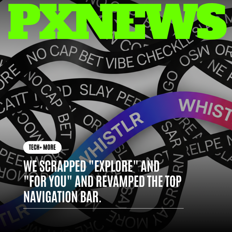
For a long time, the top of Whistlr had two tabs: "Explore" and "For You." They sounded different, but in practice they did the same thing — handed every decision to an algorithm and left you guessing about what you'd get next. So we did something we'd been thinking about for a while: we scrapped both of them. In their place is a clean, named navigation carousel that lets you choose where you want to go instead of waiting to be fed. This is the story of why we made the change, what it replaced, and how it puts you back in the driver's seat.
Two Tabs That Meant the Same Thing
Here's the honest truth about "Explore" and "For You": almost nobody could tell you the difference between them. If you tapped "For You," an invisible system decided what you saw. If you tapped "Explore," a slightly different invisible system decided what you saw. Either way, you were a passenger. The tab names promised choice, but they delivered the same black box wearing two different hats.
That mismatch quietly wore on people. When you opened Whistlr to find something specific — a community you love, the moments everyone is talking about, fresh creators you haven't met yet — neither tab pointed you there. You scrolled and hoped. And when the feed served you something off, there was no obvious lever to pull, no clear place to steer toward. The whole top of the app asked you to trust a guess instead of make a choice.
We kept coming back to one question in our reviews: if a tab doesn't tell you what's behind it, what is it actually for? Once we asked it plainly, the answer was uncomfortable. "Explore" and "For You" weren't destinations. They were a polite way of saying "the feed decides for you."
"We realized we'd named two tabs after a feeling, not a place. 'For You' isn't somewhere you can go — it's just a promise that something, somewhere, is choosing on your behalf. People deserved real doors with real labels, so they could walk through the one they actually wanted."
— Mara Olsen, Director of Product Design at ETAPX
What We Built Instead: Named Places, Not a Black Box
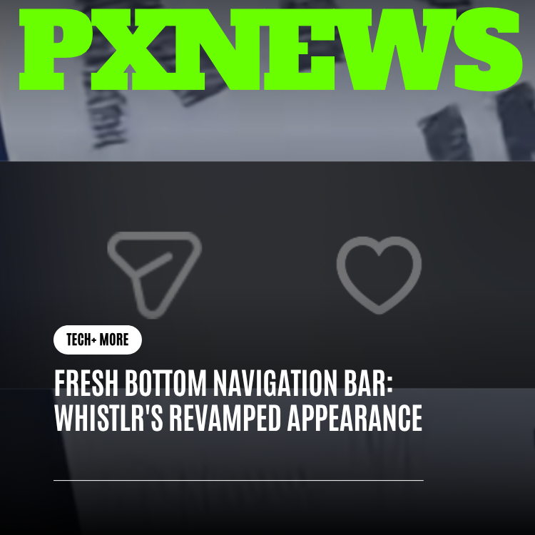
The replacement is a horizontal navigation carousel that runs across the very top of Whistlr. Instead of two vague tabs, you now get a row of clearly named destinations — each one a distinct place with its own character. You read the names, you pick the experience, and you know roughly what you're walking into before you tap. No more guessing what the algorithm has in mind.
The lineup is intentionally simple to scan: Trending, Discover, Waves, Flow, Circuts, and Highlights. Some of these names you already know from the heart of Whistlr; now they sit right at the top where you can reach them in one tap. Here's what each one is for, in plain terms:
- Trending: what's hot right now. The moments, creators, and conversations catching fire across Whistlr at this very moment. When you want to feel the pulse of the whole community, this is your first stop.
- Discover: the place to find new people and new content. Built for the itch to wander — fresh voices, creators outside your usual circle, and the kind of happy surprises that make you hit follow.
- Waves: a named destination with its own rhythm and feel, ready to dive into whenever you want a change of pace from your usual scroll.
- Flow: its own distinct space inside Whistlr — a place to settle in and let the experience carry you.
- Circuts: communities. The corners of Whistlr where people who share an interest, a vibe, or a passion gather and talk. If you've ever wanted a clear door into the group you belong to, this is it.
- Highlights: the best moments. A curated stop for standout clips, peak reactions, and the stuff genuinely worth your time when you've only got a few minutes.
The point isn't that any single one of these is dramatically new — several have been part of Whistlr's world for a while. The point is that they're now named, visible, and yours to choose between. You're not handed one opaque stream and told to trust it. You're given a set of real places and invited to go where you actually want.
How the New Navigation Bar Feels to Use
We spent as much energy on how the bar moves as on what it contains, because a navigation row you fight with is worse than no navigation at all. The result is meant to feel effortless and a little bit alive.
- It scrolls horizontally: swipe the bar left or right to slide through the destinations. Everything fits in a single, calm row you can flick through with your thumb.
- It auto-centers as you go: the tab you're on glides into the middle of the bar so you always know exactly where you are. No squinting at the edges, no losing your place.
- Tap your current tab to refresh: already on Trending and want the latest? Tap Trending again and Whistlr jumps you back to the top with fresh content. It's the satisfying "pull me back to the start" move, built right into the tab.
- A live-stream shortcut on the left: a quick way to jump into going live or catching a stream sits at the left edge, always within reach.
- Search on the right: when you know exactly what you're after, search lives at the right edge so you can go straight for it instead of scrolling and hoping.
Put together, the bar does something the old tabs never could: it tells you where you are, makes it obvious where else you can go, and gets out of your way the rest of the time. Choosing your experience now takes a single, confident tap.
"The old 'For You' tab always felt like a slot machine — I never knew what I'd get. Now I just tap Circuts when I want my people, or Trending when I want the noise. I finally feel like I'm steering instead of being dragged along."
— Devon Reyes, Whistlr creator
The Philosophy: Clarity Over Guesswork
Underneath the redesign is a belief we keep returning to at ETAPX: people are happiest when they're in control of their own experience. An algorithm can be a wonderful helper, but it shouldn't be the only thing standing between you and your feed. When the only way in is one mystery stream, you lose the ability to express intention — to say "right now, I want this, not that."
Named destinations give that intention back. "I'm in a discovering mood" leads you to Discover. "I want what everyone's reacting to" leads you to Trending. "I just want my community" leads you to Circuts. You're making small, clear choices that add up to a feed that feels chosen rather than assigned. Less guessing on your part, less guessing on ours, and a lot more of you ending up exactly where you meant to be.
"Our north star here was simple: more intention, less luck. We didn't want people to feel like they were rolling the dice every time they opened the app. Give someone a labeled door and they'll walk through it gladly. Hide everything behind one stream and you've taken their choice away — even if the stream is good."
— Priya Nandakumar, Head of Consumer Experience at ETAPX
Why This Matters for Creators
If you make things on Whistlr, this change is quietly good news. Under the old setup, your work lived or died inside a single opaque feed, and you had no real way to understand how people might find it. With named destinations, there are now clearer paths between your content and the people most likely to love it — whether they're browsing Discover for someone new, checking Trending for what's hot, or gathering in the Circuts community you call home.
It also makes the audience's intent clearer. Someone who lands on Discover is actively looking for new voices. Someone in Highlights is there for standout moments. When people arrive somewhere on purpose, the connection between creator and viewer starts from a stronger place — and that tends to be better for everyone making the effort to show up and create.
What Stayed the Same
We want to be clear about what didn't change, because thoughtful editing matters as much as bold removal. The smart recommendations you liked aren't gone — they still help shape what shows up inside places like Trending and Discover. We didn't throw out personalization. We threw out the part where personalization was the only option and you couldn't see around it.
Your favorite communities, the creators you follow, the moments you've come to expect — all of it is still here. What's different is the front door. Instead of two tabs that pointed nowhere in particular, you now walk into a hallway of clearly marked rooms and choose the one you're in the mood for.
Settling In to the Change
Any time you move someone's furniture, there's a moment of "wait, where did that go?" We expected that, and we think it fades fast. Within a few sessions, most people stop thinking about the bar at all and just start tapping the place they want. That's the goal of good navigation — it should disappear into habit. The difference is that the habit you build now is one of choosing, not waiting.
We'll keep listening as people live with it. If a destination needs a clearer name, a better home on the bar, or a sharper sense of what it's for, we'd rather adjust than defend. The whole reason we made this change was to listen to what people were quietly telling us about "Explore" and "For You" — and that listening doesn't stop now that the new bar is live.
Frequently Asked Questions
What happened to the "Explore" and "For You" tabs?
We removed both. They were vague and interchangeable, and they handed every decision to an invisible algorithm. In their place is a horizontal navigation carousel with clearly named destinations — Trending, Discover, Waves, Flow, Circuts, and Highlights — so you choose your experience instead of being fed one.
Does this mean Whistlr stopped recommending content to me?
Not at all. Smart recommendations still help shape what you see inside places like Trending and Discover. The difference is that you now decide which kind of experience you want first, instead of being dropped into one stream with no say in the matter.
How do I refresh a feed in the new navigation?
Just tap the tab you're already on. If you're in Trending and want the latest, tap Trending again — Whistlr jumps you back to the top with fresh content. It's the same satisfying "back to the start" motion, built right into each destination.
Where did live streaming and search go?
They're right where your thumbs expect them. A quick live-stream shortcut sits at the left edge of the bar, and search lives at the right edge. The named destinations fill the scrollable space in between.
What's the difference between Trending, Discover, and Highlights?
Trending is what's hot across Whistlr right now. Discover is for finding new people and content you haven't met yet. Highlights gathers the best standout moments worth your time. Each is its own place with its own character, so you can pick based on the mood you're in.
This is just the first step in a bigger idea: a Whistlr where you always know where you are and where you can go next. Clear, named places are the foundation, and we're excited to keep building on top of them — adding character to each destination, sharpening the choices, and making sure that every time you open the app, the experience is one you chose, not one you were handed.