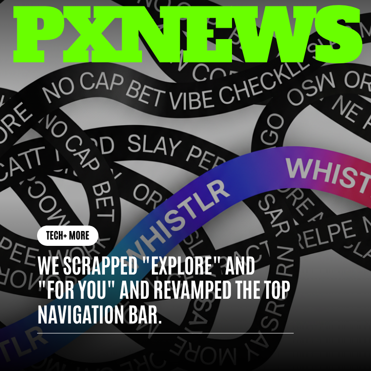
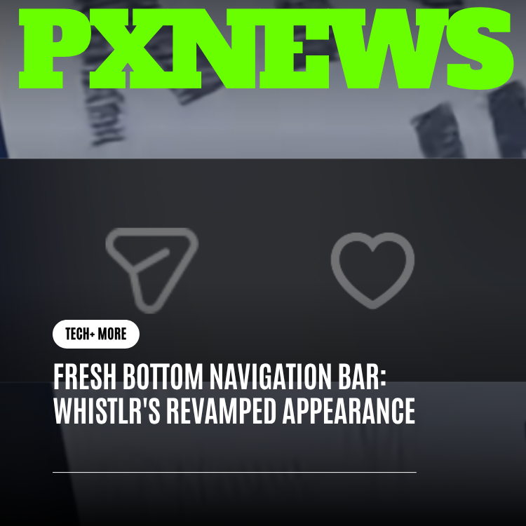
There's a certain magic in the small things you stop noticing because they just work. Whistlr's bottom navigation bar is one of those things, and we just gave it a fresh coat of paint. Gone is the solid strip pinned to the bottom edge of your screen. In its place: a floating glass pill that hovers just above the bottom, lighter and more premium, leaving more room for the content you actually came to see. It's a small change you'll feel everywhere.
If you've opened Whistlr in the last few days, you might have done a quick double-take. Something feels different, even if you can't immediately put your finger on it. That's by design. The new bottom navigation is one of those refinements that works best when it fades into the background and simply feels right. But since we love this kind of detail, we want to walk you through exactly what changed, why we changed it, and what it does for your everyday experience.
From a Pinned Strip to a Floating Pill
For a long time, Whistlr's main navigation lived in a solid bar bolted to the very bottom edge of your screen. It did its job. It got you between your pages. But it always felt a little heavy, like a shelf running the full width of your phone, separating your content from the edge of the world with a hard line.
The new design lets go of that edge entirely. Instead of a strip welded to the bottom, you now get a compact pill that floats above the bottom of the screen, detached from the corners and sides. It hovers. And that one change in physics, the act of lifting it off the edge, completely shifts how the whole app feels. Lighter. More modern. More like something designed for the way phones look today, with their rounded corners and edge-to-edge screens.
"We kept coming back to one idea: navigation should feel like it's resting on top of your content, not boxing it in. The moment we let the bar float, everything else relaxed. It stopped feeling like furniture and started feeling like part of the experience."
— Mara Vidal, Design Lead at ETAPX
A Glass Pill That Knows Where You Are
Let's talk about the look, because this is where the redesign really sings. The new navigation is a dark, translucent glass pill, the kind of surface that hints at what's behind it without ever getting in the way. It's deliberately minimal: icons only, no text labels cluttering things up. You already know your home from your messages from your profile, so we trust you with a clean, label-free row of icons that reads instantly.
And because clarity still matters, there's one beautiful little detail that ties it all together: a soft white highlight that glides to whichever tab you're on. Tap a different icon and the glow slides over to meet it, smooth and unhurried. You never have to wonder where you are in the app, because your place is always gently illuminated. It's the difference between a sign that flickers on and a light that follows you.
- Translucent glass surface: A dark, semi-see-through pill that feels premium and stays out of your way.
- Icons only, no labels: A cleaner, less cluttered row that reads at a glance and looks effortlessly modern.
- The gliding highlight: A soft white glow slides to your current tab, so you always know exactly where you are.
- Floating, not fixed: Lifted off the bottom edge, detached from the corners, giving the whole app room to breathe.
Swipe Across to Move Around
Here's the part that turns a nice-looking redesign into a genuinely better way to get around: you can swipe. Drag your thumb left or right across the pill and you'll glide between your main pages, fast and tactile. No precise tapping required, no reaching for a tiny target. Just a flick.
It sounds like a small thing, but it changes the rhythm of how you use Whistlr. Your thumb naturally rests near the bottom of the screen, and now that's all the reach you need to move between the places you visit most. Tap when you want precision, swipe when you want speed. The pill responds to both, and the highlight follows your finger so the motion feels physical, like you're actually sliding something rather than poking at a menu.
"I genuinely did not expect to care this much about a nav bar. But the swipe is addictive. I catch myself flicking between my feed and messages just because it feels good. It's such a tiny thing and yet the whole app feels faster now."
— Devon Hartley, Whistlr creator
Navigation That Knows When to Disappear
The best navigation is the kind that shows up when you want it and gets out of the way when you don't. The new pill is smart about this. When you scroll down into your content, settling in to read, browse, or watch, the pill quietly tucks away. The screen becomes yours, edge to edge, with nothing hovering over the bottom of what you're looking at.
Then, the instant you scroll back up, it glides right back into place, ready when you are. You never have to think about it. The pill reads your intent from the way you move through the app: leaning into content means you want focus, so it bows out; reaching back up means you're ready to navigate again, so it returns. It's the kind of behavior that feels obvious the moment you experience it, even though you never asked for it.
Frameless for Full-Immersive Video
When you drop into a full-immersive video, the rules change, and the navigation knows it. In that mode, the pill goes completely frameless. Nothing floats over the footage, nothing competes for your attention, nothing pulls your eye away from what you came to watch. It's just you and the video, filling the screen the way it's meant to.
This was a non-negotiable for us. Video is one of the most loved corners of Whistlr, and the last thing a great clip needs is a menu hovering at the bottom of the frame. By letting the navigation vanish entirely during immersive playback, we made sure the content always wins. When you're done, a simple gesture brings everything back.
Why We Did This: More Room for What Matters
Every pixel on your screen is precious. The old solid bar claimed a permanent slice of real estate at the bottom, a fixed cost you paid on every screen whether you needed navigation in that moment or not. The floating pill changes the math. Because it's compact, because it tucks away when you scroll, and because it disappears entirely during immersive video, your content gets dramatically more room to shine.
That extra space adds up. Feeds feel more open. Photos and videos breathe. The first impression when you open the app is cleaner and calmer, less chrome and clutter, more of the stuff you came for. We think a social app should feel like it's mostly your friends, your creators, and your communities, with the interface acting as a quiet frame around all of it rather than the main event.
- More content, less chrome: A compact pill that gives screens noticeably more breathing room.
- A cleaner first impression: Open the app and you're greeted by content, not a heavy bar.
- Effortless, physical navigation: Tap, swipe, or just scroll, the pill keeps up with however you move.
- Distraction-free viewing: Full-immersive video stays truly full, with nothing hovering on top.
Part of a Bigger Visual Polish Pass
This redesign doesn't stand alone. It's one piece of a broader visual polish pass we're rolling out across Whistlr, a steady effort to make every surface feel a little more refined, a little more considered, a little more yours. The navigation pill is the most visible early result, but you'll notice the same care turning up in other corners of the app over the coming weeks.
Our philosophy here is simple: the details are the experience. A glow that glides smoothly, a bar that floats instead of clings, a swipe that feels just right, these are the things that, stacked together, make an app feel alive rather than merely functional. We'd rather sweat the small stuff than ship something that's merely fine.
"Polish isn't decoration, it's respect for the person on the other side of the screen. When the little interactions feel good, people trust the whole product more. This nav refresh is us saying we sweat those details, and there's plenty more coming."
— Mara Vidal, Design Lead at ETAPX
What You Need to Do
Nothing, really, and that's the point. The new bottom navigation arrives as part of Whistlr's latest look, so the next time you open the app you'll simply find it waiting for you. There's no setting to flip, no tutorial to sit through. Open Whistlr, glance at the bottom, and you'll see the floating pill ready to go. Give it a swipe, scroll into your feed, watch it tuck away, and let the new feel become second nature, which it will, faster than you'd expect.
Frequently Asked Questions
What actually changed about the bottom navigation in Whistlr?
The bottom bar used to be a solid strip pinned to the very bottom edge of your screen. Now it's a floating, rounded glass pill that hovers just above the bottom, detached from the edges. It's a dark translucent surface with icons only, a soft white highlight that glides to your current tab, and it tucks away when you scroll into content.
How do I switch between pages now?
You have two easy options. Tap any icon to jump straight to that page, just like before. Or swipe left and right across the pill to glide between your main pages quickly. The highlight follows along so you always know where you've landed. Use whichever feels natural in the moment, the pill responds to both.
Why does the navigation bar disappear sometimes?
That's intentional, and it's there to give you more screen. When you scroll down into your content, the pill tucks away so nothing hovers over what you're reading or watching. Scroll back up and it glides right back into place. During full-immersive video, it goes completely frameless so nothing competes with the footage.
Do I need to update anything or change a setting to get the new look?
No setup required. The redesigned navigation comes as part of Whistlr's latest look, so you'll see it automatically the next time you open the app. There's nothing to enable, nothing to configure, and no tutorial to complete. It's simply there, ready to use.
Is this the only thing being redesigned?
Not at all. The floating navigation pill is the first highly visible piece of a broader visual polish pass rolling out across Whistlr. Over the coming weeks you'll notice the same attention to detail showing up in other parts of the app as we keep refining the look and feel throughout.
This refresh is just the opening note. As we continue tuning Whistlr surface by surface, expect the whole app to keep getting cleaner, calmer, and more delightful to move through, always with the same goal in mind: more room for your content, and navigation that feels effortless enough to forget. We can't wait to show you what's next.