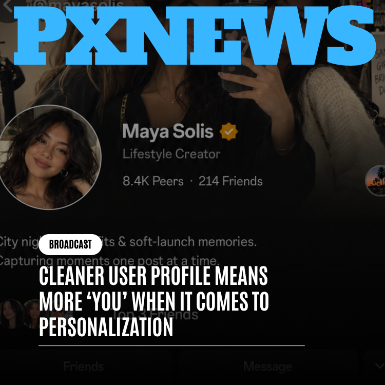
Whistlr just shipped one of those changes that's easy to undersell in a headline: the profile got quieter. No new feature launched alongside it, no fresh customization option, no additional thing to turn on or configure. Instead, ETAPX went back through the profile page that carries a person's Moods and Blips, their Halo, their chosen Profile Skin, their bio, and their pinned content, and asked a different question than usual — not "what else can we add here," but "what can we take away." The answer turned into a genuine decluttering pass: trimming repeated icons, tightening inconsistent spacing, collapsing redundant counters, and generally clearing out the visual static that had been quietly accumulating around the parts of a profile that are actually personal. The result isn't a redesign in the dramatic sense. It's a profile with less chrome and more room for the things that were already the point.
This is a story about restraint, which makes it a slightly unusual one to tell. Most product announcements are about addition — a new capability, a new surface, a new way to express yourself. This one is about subtraction, and about why subtraction, done carefully, can matter just as much. Whistlr's profile has picked up a lot of genuinely great features over the past year: a living-snapshot layout, Halo's ambient presence ring, fully customizable Profile Skins, Moods and Blips that update constantly. Each of those shipped as its own deliberate, well-reasoned addition. What hadn't happened, until now, was a pass through the page asking whether everything surrounding those features was still earning its space, or whether some of it had just been sitting there out of habit.
The Problem Nobody Announces: Accumulated Clutter
Clutter rarely arrives all at once. It builds up one small, reasonable-seeming addition at a time. A counter gets added because a stat feels worth surfacing. A label gets added because a new feature needs a name attached to it somewhere. A little icon gets added because it helps someone at a glance. None of these decisions look wrong in isolation — each one, on its own review, made sense. But stack enough of them on top of each other over enough product cycles, and you end up with a page that's technically informative and practically loud, where every element is fighting every other element for a sliver of attention that none of them fully deserves on its own.
That's roughly what had happened to the Whistlr profile. Not because any single addition was a bad call — most of them were good calls, taken individually — but because nobody had gone back through with a critical eye asking whether the whole assembly still made sense together. Repeated iconography showed up in more than one place doing more or less the same job. Stat blocks sat dense and tightly packed, each number given roughly the same visual weight whether it mattered a lot or barely at all. Small labels and secondary counters crowded the space immediately around the elements that actually change from day to day — your current Mood, your Blip, the ring of light around your avatar. The page wasn't broken. It was just busier than it needed to be, and busy pages have a specific, quiet cost: they make it harder for the genuinely personal parts of a profile to actually register.
"You can tell a profile has drifted when you look at it fresh and can't immediately say what it wants you to notice first. That was happening to us. Nothing on the page was wrong, exactly — it had just accumulated. Icons that used to mean something specific were now sitting next to three other icons that looked almost the same. Counters that used to be useful had turned into wallpaper. We didn't need a new feature to fix that. We needed to go back through with a much less forgiving eye and ask what was actually still doing work."
— Renata Osei, VP of Product, ETAPX
Less Chrome, More You: The Guiding Idea
The phrase that kept coming up internally while this work was underway was simple: less chrome, more you. "Chrome," in the sense the team used it, means all the surrounding interface — the counters, the borders, the repeated icons, the structural furniture of a page that exists to support the content rather than to be the content. Every page needs some chrome. The problem is when chrome starts crowding out the thing it's supposed to be supporting, and on Whistlr's profile, that's exactly what had started to happen. Your Mood, your Blip, your Halo, your Skin, your bio — the parts of the page that are actually, unmistakably you — were sharing visual real estate with dense stat blocks and duplicated icon rows that were, at best, neutral background noise. The idea behind this pass wasn't to make the profile feel emptier for its own sake. Minimalism as an aesthetic goal, on its own, isn't a particularly interesting reason to change a page that people rely on every day. The actual goal was legibility of personality. When the surrounding chrome gets quieter, the personal elements don't have to compete as hard to be seen — they simply become the obvious, uncontested focal point, the way a single clear voice in a quiet room carries further than the same voice shouting over three other conversations. Quieter chrome doesn't mean a quieter profile. It means the parts of a profile that were always meant to be loud — your identity, your presence, your personalization choices — finally get to be the loudest thing on the page, instead of splitting the volume with everything around them.
What Specifically Got Simplified
None of the changes in this pass are individually dramatic. Taken together, they add up to a page that reads noticeably calmer without losing a single piece of information that mattered. A few of the categories of change worth walking through:
- Redundant counters collapsed: Where the old layout showed related numbers in separate, visually competing blocks, related stats are now grouped and presented once, cleanly, instead of being split across the page in slightly different formats that all said roughly the same thing.
- Repeated iconography trimmed: Several small icons that had ended up doing near-identical jobs in more than one spot on the page were consolidated down to a single, clear instance, so the eye isn't asked to recognize the same visual cue three separate times before it means anything.
- Spacing made consistent and generous: Sections that used to sit tightly packed against each other now have deliberate breathing room, so the page reads as a series of clear, distinct areas rather than one dense block of information stacked from top to bottom.
- Visual hierarchy sharpened: Secondary details — the kind of information you'd look for if you went searching for it, but wouldn't expect to be handed immediately — were pulled back in visual weight, so the elements that deserve first attention actually get it.
- Low-value labels removed outright: A handful of small text labels that restated something already obvious from context were simply removed, on the theory that a page doesn't need to caption things a person can already see and understand.
What's notable about that list is what isn't on it. Nothing was hidden behind an extra tap. Nothing that used to be one click away is now two clicks away. No functionality moved, shrank, or became harder to find. This was strictly a visual and organizational cleanup — the kind of change where, if you weren't paying close attention, you might not be able to point to any single element and say "that's new." What you'd notice instead, without necessarily being able to name it, is that the page simply feels calmer to look at. That's the intended effect, and it's a difficult one to get right precisely because it's supposed to be felt rather than spotted.
Why This Matters More Than It Sounds Like It Should
It's fair to ask why a spacing-and-clutter pass deserves this much explanation. The honest answer is that decluttering work like this is chronically undervalued, both by the people who build products and by the people who write about them, because it doesn't produce a satisfying before-and-after headline the way a new feature does. But the effect on how a page actually functions can be significant, precisely because attention is a limited, finite resource. A visitor to your profile has a certain amount of attention to spend before they move on, and every extra icon, every redundant counter, every unnecessary label is attention spent on something that wasn't the point. Remove enough of that, and the attention that's left over goes almost entirely to the things that were always supposed to matter most. This is especially true for a profile carrying as much genuinely personal content as Whistlr's now does. A profile with a single static photo and a bio field doesn't have much of a clutter problem to worry about — there's not enough on the page for competing elements to compete over. But a profile with an animated Blip, a current Mood, a Halo ring, a chosen Profile Skin, a bio, and pinned content has a lot of genuinely expressive material sharing one page, and expressive material needs room around it to actually register as expressive. Crowd it, and even the best individual features start to blur together into background noise. Give it room, and the same features suddenly read as a coherent, considered presentation of a real person.
"Every feature we've shipped on the profile over the last year — Halo, Skins, Moods, Blips — was built to say something about a real person. None of that works if the page around it is loud enough to drown it out. This pass wasn't about adding anything. It was about getting out of the way of everything we'd already built, so it could finally be seen clearly instead of competing with its own surroundings for attention."
— John Ridge, CTO, ETAPX
How This Interacts With Halo, Profile Skins, and Moods and Blips
The clearest way to understand what changed is to look at how it affects the features that were already there. None of them were altered functionally — this wasn't a redesign of Halo, Skins, or Moods and Blips, and nothing about how any of them work has changed. What changed is how much visual room each of them now has to actually be seen clearly against everything else on the page. Halo, by design, has always been intentionally restrained — a soft, low-opacity ring that pulses gently around an avatar rather than demanding attention the way a badge or a notification count does. That restraint is the entire point of Halo, but restraint only reads clearly when it isn't sitting next to a lot of other visual noise competing for the same glance. With redundant icons and dense counters cleared away from around the avatar, Halo's glow has more visual quiet to sit inside, which means it does its subtle job more effectively than before — not because Halo itself changed, but because the page finally gives its subtlety somewhere to land. Profile Skins work the same way, from the opposite direction. A Skin recolors and retextures the frame of a profile — backgrounds, accents, section framing — and that frame reads best when it isn't fighting a crowded foreground of stat blocks and repeated iconography for attention. A busier page made even a well-designed Skin harder to fully appreciate, because there was simply more competing visual information layered on top of it. With that competing information trimmed back, a chosen Skin's personality — whether it's warm and textured or high-contrast and bold — comes through more clearly, because there's less standing between a visitor and the actual look of the page. Moods and Blips benefit most directly of all, because they were the reason the profile became a "living snapshot" in the first place. A Mood badge glowing beside your name and a Blip animating in its circular frame are meant to be the first things a visitor notices and understands — a real-time read on who you are and how you're feeling right now. That only works if nothing nearby is pulling equal or greater attention toward itself. Clearing out adjacent clutter doesn't change what a Mood or a Blip looks like. It changes how immediately they register, which, for features whose entire value is in being noticed at a glance, is close to the whole point.
"I went to my profile expecting nothing to be different and almost scrolled right past it before I noticed — everything just looks calmer. My Blip actually stands out now instead of getting lost next to a bunch of numbers I never look at anyway. I couldn't tell you exactly what moved, I just know I like looking at my own page more than I did last week."
— Marisol Tan, Whistlr user
A Deliberately Unglamorous Kind of Work
It's worth being honest that this kind of pass doesn't make for an easy pitch internally. Decluttering work competes for the same design and engineering time as new features, and new features are, understandably, the easier thing to prioritize — they come with a launch, a headline, something concrete to point to. A pass focused on removing redundant counters and tightening spacing has to be justified on a different basis entirely: not "look what this adds," but "look how much more clearly everything else now comes through." That's a harder case to make, and it's one of the reasons pages like this tend to accumulate clutter for longer than anyone intends before someone finally goes back and does the unglamorous work of cleaning it up. ETAPX made the call to prioritize it anyway, on the reasoning that a profile carrying this much genuinely personal expression — Halo, Skins, Moods, Blips, bios, pinned content — had reached a point where the surrounding noise was actively working against everything else the team had built. Letting that keep accumulating would have meant every future addition to the profile competing with an ever-growing pile of visual furniture, making each new feature slightly less effective than the last simply by virtue of having more to compete with. Clearing it out now was framed internally less as a one-time cleanup and more as maintaining the conditions that let future personalization features actually land the way they're meant to.
What Didn't Change
It's worth being explicit about the boundaries of this update, because decluttering passes can sometimes get misread as bigger overhauls than they actually are. Nothing about how you set your Mood, record a Blip, choose a Profile Skin, or manage your Halo changed. No settings moved. No feature was removed, hidden behind a paywall, or made harder to access. Your existing profile — whatever Skin you've applied, whatever Mood you're currently signaling, whatever content you've pinned — carries over exactly as it was, just presented with more room around it. If you've never once thought about spacing or icon density on your own profile, that's honestly the intended outcome. Good decluttering work is supposed to be felt, not noticed.
- Halo: Same ring, same pulse states, same meanings — just less competing for attention nearby.
- Profile Skins: Same themes, same application process, same free-for-everyone availability — now with a clearer frame to show them off in.
- Moods and Blips: Same functionality, same update cadence, same living-snapshot presentation — now given more visual authority on the page.
- Bio and pinned content: Same content, same editing controls, now with cleaner surrounding structure instead of crowded adjacent elements.
What's Next
This pass is being treated internally less as a finished project and more as a new baseline the team intends to hold itself to going forward. Rather than letting clutter quietly reaccumulate the same way it did the first time, the design team is planning to build a lighter, more deliberate review into how future profile additions get evaluated — asking, before anything new ships, not just whether it's useful, but whether it earns the visual space it would need to sit comfortably alongside everything already there. The goal isn't to freeze the profile in its current, quieter state forever. Whistlr will keep adding to what a profile can do and express. The goal is to make sure that whatever comes next gets added with the same care that just went into clearing everything else out of the way.
Frequently Asked Questions
What actually changed on the Whistlr profile with this update?
This was a visual decluttering pass, not a new feature or a structural redesign. Redundant counters were consolidated, repeated icons were trimmed down to single clear instances, spacing was made more consistent and generous, and low-value labels that restated obvious information were removed. Nothing about how any profile feature functions has changed.
Did Halo, Profile Skins, or Moods and Blips change with this update?
No, not functionally. All three work exactly as they did before this pass. What changed is the surrounding page — with less visual noise nearby, each of these features has more room to register clearly at a glance instead of competing with dense stat blocks and repeated iconography for attention.
Do I need to do anything to see the cleaner profile layout?
No. The update applies automatically to every Whistlr profile. Your existing Mood, Blip, Halo state, Profile Skin, bio, and pinned content all carry over exactly as they were, just presented within the newly decluttered layout.
Was any information or functionality removed from the profile?
No functionality was removed, and no information that people actually rely on was taken away. What was removed were redundant visual elements — duplicate icons, restated labels, densely packed counters — that were adding visual weight without adding meaningfully new information.
Why did ETAPX prioritize this kind of cleanup instead of a new feature?
Because the profile had accumulated enough surrounding visual clutter that it was starting to work against the genuinely personal features already built into it — Halo, Skins, Moods, and Blips. Rather than let that keep building up, the team treated clearing it out as a way of protecting the effectiveness of everything already shipped, and of everything still to come.
None of this will show up as a headline feature in anyone's memory of Whistlr, and that's more or less by design. The measure of whether it worked isn't whether people notice the change — it's whether they notice their own Mood, their own Blip, their own Skin, a little more clearly than they did before. Less chrome, more you. That was the whole idea.