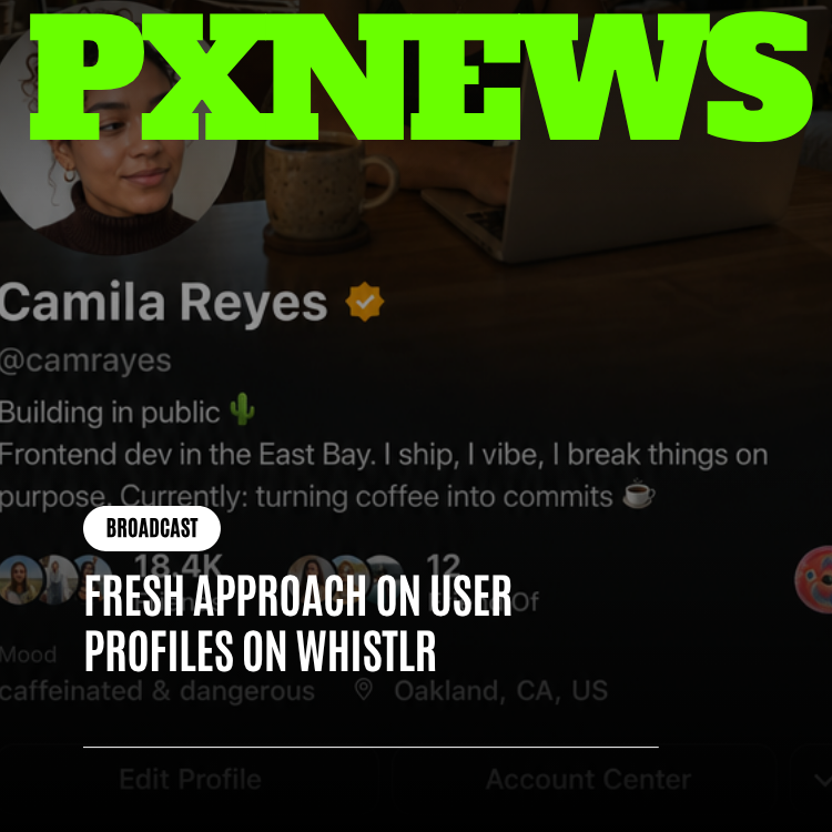
ETAPX has shipped a fresh approach to user profiles on Whistlr, rebuilding the page every person calls home on the platform from the ground up. It is not a new feature bolted onto the side of the app — it is a rethink of the layout, hierarchy, and philosophy behind how a profile presents a person. The old template asked everyone to fit their identity into the same rigid boxes; the new one asks a simpler question: what does someone actually need to see, in what order, to understand who you are right now? This article walks through why the previous profile layout had quietly become a liability, what changed in the redesign, how it brings Moods, Blips, video banners, and relationship context together for the first time, and why a personal profile deserves to be treated as the home base of someone's entire presence on Whistlr — not an afterthought tucked behind the feed.
Profiles are strange objects. They are the one page on a social platform that never fully belongs to the feed's rhythm of scroll-and-forget. A post lives for a moment and gets buried by the next one; a profile sits still, waiting to be visited, expected to answer the question "who is this person?" in a single glance. That makes it one of the most important surfaces in the entire app, and also one of the easiest to get wrong. Get a profile right, and it becomes a place people are proud to send friends to. Get it wrong, and it becomes a page nobody thinks about — technically present, practically invisible. This redesign was ETAPX's attempt to make sure Whistlr profiles land firmly in the first category.
The Old Profile Problem: A Resume, Not a Snapshot
To understand why user profiles needed a fresh approach, it helps to be honest about what the old layout actually was: a resume. Photo at the top, name and handle underneath, a bio field, a static row of stats, and then a grid of posts stretching down forever. It was organized the way a job application is organized — credentials first, personality somewhere further down if there was room for it at all. That structure works fine for a professional networking site where the goal is to establish credibility once and leave it alone. It works badly for a platform built around real relationships between real people whose lives change week to week.
The deeper issue was that the old layout treated every piece of information with equal weight and equal permanence. A profile photo taken two years ago sat with the exact same visual authority as a mood set five minutes ago. A bio nobody had touched since sign-up occupied the same prime real estate as an active relationship status update. There was no sense of "now" anywhere on the page — everything looked frozen, because the layout itself gave every element the same flat, static treatment regardless of how current or how personal it actually was. A profile is supposed to be a living snapshot of who someone is; the old template rendered it as a plaque.
There was also a quieter cost: the rigidity of the template discouraged self-expression rather than inviting it. When every profile on the platform is forced into the identical stacking order — photo, name, bio, stats, grid — with no room to let one part of someone's identity take the lead over another, people start to feel like they are filling out a form rather than presenting themselves. A person whose Blip and video banner are the most expressive things about them had those buried under stat counters. Someone whose relationship status is the thing they most want visible had it competing for attention with a bio nobody scrolls to read. The template was doing the deciding, not the person.
A Fresh Approach to User Profiles: The Design Philosophy
The redesign starts from a different premise entirely. Instead of asking "what fields does a profile need," the team asked "what does a person actually want someone new to see first, second, and third?" That single shift in framing is the fresh approach at the center of this whole project, and it touches nearly everything about how a Whistlr profile now looks and behaves.
The guiding principle is presence over paperwork. A profile should feel like walking into a room where someone is standing right in front of you — not like opening a filing cabinet. That means leading with the things that are alive: your current Mood, your Blip in motion, your video banner playing behind everything else. It means treating your stats as supporting context rather than the headline. And it means giving your bio and your self-description room to breathe as an actual statement about you, not a cramped caption squeezed between a follow button and a grid of thumbnails.
"We stopped designing profiles like forms and started designing them like introductions. A form asks you to fill in blanks. An introduction leads with the parts of you that are true right now — how you're feeling, what you look like today, who matters to you. That's the fresh approach we wanted for user profiles on Whistlr, and once we saw it that way, the old hierarchy didn't make sense anymore."
— John Ridge, CTO, ETAPX
What makes this philosophy more than a slogan is that Whistlr already had the ingredients waiting. Moods give people a one-tap way to signal how they feel today. Blips turn a static avatar into a short looping clip of real motion. Video profile banners let someone set the entire backdrop of their page in motion. Relationship status features, built consent-first with mutual confirmation, let people share who matters to them without anyone being able to claim a connection that isn't real. Every one of these features already existed on Whistlr before this redesign — what was missing was a layout smart enough to let them work together instead of competing for the same cramped inches of screen.
Visual Hierarchy: What Leads, What Follows
The clearest sign of the fresh approach is the new visual hierarchy itself. Where the old profile stacked everything with roughly equal visual weight, the redesigned page makes deliberate, confident choices about what earns the top of the screen and what supports it underneath.
Leading With Presence, Not Data
The first thing anyone sees on a redesigned Whistlr profile now is presence: the video banner playing quietly behind the header, the Blip animating inside its frame, the current Mood glowing in its signature color right beside the name. These are the elements that answer "who is this person, today" — and they now get the visual authority to do that job. Numbers, by contrast, have been pulled back from the spotlight. Follower counts and post counts still exist, and they are still easy to find, but they no longer dominate the first impression the way they used to. A profile now introduces a person before it reports on them.
Making Room for Moods, Blips, and Video Banners to Work Together
One of the trickier design problems the team solved was letting three expressive, motion-based features — Moods, Blips, and video banners — occupy the same header without visually fighting each other. In the old layout, adding any one of these felt like squeezing in an extra element that didn't quite have a home. In the new layout, they are treated as a set: the video banner sets the scene, the Blip sits in its familiar circular frame with room to actually move, and the Mood reads as a small glowing badge beside the name rather than a line of text competing with the bio. Each element gets its own defined space and its own moment of attention, so a page that could easily have become visually noisy instead reads as coherent — more like a well-composed photograph than a cluttered bulletin board.
Relationship status, when someone has chosen to share it, now sits naturally within that same header context rather than being buried in a settings-style subsection. Because the underlying feature is consent-first and requires mutual confirmation, what appears on a profile is always something both people agreed to show — and the redesigned layout gives that mutual, confirmed detail a visible, respectful place near the top of the page instead of hiding it several scrolls down.
Clearer Stats, Less Noise
Stats didn't disappear in the fresh approach — they got demoted from headline to supporting detail, and reorganized so they are actually easy to read at a glance instead of a wall of numbers. The redesigned stats row groups related information together, uses consistent spacing so counts don't feel like they're competing with each other for attention, and sits below the expressive header elements rather than above them. The result is a profile where you understand who someone is before you understand how many people follow them — which is the order most people actually want to be understood in.
This reordering reflects a broader belief behind the redesign: that a profile's job is to build a human impression first and a credibility signal second. Stats still matter — they give context, they show activity, they help newcomers get oriented — but they were never meant to be the main event. Presenting them with more restraint, more whitespace, and clearer grouping makes them easier to actually use rather than just easier to stare at.
Room to Be Genuinely You: Self-Expression Over Template
Perhaps the most meaningful change in the redesign is the least visible one: the new profile layout is built to flex around a person instead of forcing a person to flex around it. Someone who leans heavily on their Blip and video banner for self-expression can let those carry the page. Someone whose Mood changes several times a day can let that badge do a lot of the talking. Someone who prefers a quieter, more understated presence can lean into a simple bio and let the rest sit calmly in the background. The template no longer insists that everyone perform identity the same way.
A few of the specific changes that make this flexibility possible:
- Adaptive header composition: The header intelligently balances whichever expressive elements someone has set — video banner, Blip, Mood, relationship status — instead of forcing all four into an identical fixed template regardless of what a person has actually chosen to share.
- Breathing room for bios: Bio text is no longer squeezed into a single cramped line competing with buttons and stats. It now has its own clear, legible space to actually say something.
- Consistent, calmer stat presentation: Stats are grouped and spaced for quick scanning rather than dominating the page, so they inform without overwhelming.
- A grid that supports rather than competes: The post grid below the header keeps its familiar, browsable structure, but now sits clearly beneath a confident identity section instead of crowding it.
- Consent-first relationship display: Shared, mutually confirmed relationship status now has a natural, visible home in the header rather than being buried, while staying entirely opt-in on both sides.
Taken together, these changes turn the profile from a rigid container into something closer to a frame that adapts to what's inside it. That is the essence of the fresh approach: less insisting on a single correct way to present yourself, more building a layout flexible enough to let genuine self-expression lead.
"My profile finally feels like it's actually mine. Before, everything just sat in the same boring stack no matter what I did — now my Blip and my Mood are the first thing people notice when they land on my page, exactly the way it should be. It feels like walking into a room instead of reading a spec sheet."
— Priya Chandrasekaran, Whistlr user
Your Profile as Home Base: Why This Matters
It's worth stepping back and asking why any of this matters beyond aesthetics. The answer is that a profile isn't just one page among many on Whistlr — it's the home base of a person's entire identity on the platform. Every post links back to it. Every comment carries a small version of it. Every new connection starts by visiting it. If the feed is where people show up in motion, the profile is where they stand still long enough to actually be understood. That makes it disproportionately important relative to how much time any single person spends looking at their own.
You rarely stare at your own profile — you're too busy living on the feed, in messages, on streams. But everyone else looks at it constantly, in the moment they're deciding whether to follow you, respond to you, or trust you. A profile that undersells who you are undersells you everywhere else on the platform, silently, in the background, every single time someone new arrives. Getting it right isn't a cosmetic nicety; it's giving people's identity the home base it deserves.
That's also why this redesign leans so heavily on presence rather than static credentials. A home base should feel occupied — like someone actually lives there — not like an empty lobby with a nameplate on the door. Moods make the page feel current. Blips make it feel alive. Video banners make it feel like an actual space rather than a form. And a clearer stat presentation means none of that liveliness gets crowded out by numbers nobody was trying to read first anyway.
"A profile is the one piece of real estate on Whistlr that belongs entirely to you. Everything else is shared — the feed, the communities, the comment threads. Your profile is yours. This redesign was about making sure it finally felt that way: like a home base for your identity, not a form you filled out once and forgot."
— AJ, Founder & CEO, ETAPX
What's Actually Different: A Practical Walkthrough
Stepping through the redesigned profile in order, from the perspective of someone visiting it for the first time, makes the fresh approach concrete rather than abstract.
The page now opens with the video banner in motion, setting an immediate tone before a single word is read. Layered over and beside it sits the Blip — still in its familiar circular frame, but now with clearer visual separation so its motion actually reads instead of blending into the banner behind it. Beside the name and handle, the current Mood appears as a small glowing badge in its own signature color, giving a one-glance answer to "how is this person doing right now" before anyone has to ask. Where two people have mutually confirmed a relationship status, that context now sits naturally nearby, visible and respected rather than hidden.
Below that expressive header comes the bio, given genuine room to be read rather than skimmed past. Beneath the bio, the stats row presents follower, following, and post information in a clean, evenly spaced line — informative without shouting. And beneath all of it, the familiar content grid continues to do what it always did: giving visitors an easy, browsable trail into someone's actual posts, Minis, and shared moments. Nothing about the grid itself needed reinventing; it simply needed a stronger, more human introduction above it.
The net effect, page after page, is a platform that finally treats a profile the way people actually think about themselves — not as a static resume to be filed once, but as a living snapshot that gets to change as often as they do.
Frequently Asked Questions
What exactly changed with Whistlr's fresh approach to user profiles?
The redesign changes the layout, hierarchy, and philosophy of the profile page rather than adding new features. Presence-based elements — video banners, Blips, and Moods — now lead the page, stats have been reorganized to be clearer and less dominant, bios have more room to breathe, and mutually confirmed relationship status has a natural, visible home. No new profile features were introduced; existing ones were finally given a layout worthy of them.
Do I need to set up anything new to see the redesigned profile?
No. If you already have a Whistlr profile, the fresh layout applies automatically. Anything you had already set — your Mood, your Blip, your video banner, your bio, your relationship status — carries over directly into the new presentation. There's nothing to migrate or reconfigure.
Why did ETAPX prioritize a profile redesign specifically?
Because the profile is a person's home base on Whistlr — the one page that represents them everywhere else on the platform, from posts to comments to new connections. The old layout treated it like a static resume, with every field given equal, frozen weight regardless of how current or personal it actually was. A fresh approach to user profiles was overdue because identity on Whistlr was never meant to be static.
How do Moods, Blips, and video banners work together in the new profile?
They are treated as a coordinated set rather than competing elements. The video banner sets the scene behind the header, the Blip occupies its familiar circular frame with clear room to animate, and the Mood appears as a small glowing badge beside the name. Each has its own defined space, so a header that could easily feel cluttered instead reads as one coherent, expressive introduction to who you are.
Is relationship status still private and consent-based on the redesigned profile?
Yes, entirely. The redesign only changes where mutually confirmed relationship status appears on the page — giving it a clearer, more natural home in the header — not how it works. It remains consent-first and requires mutual confirmation from both people before anything is shown, exactly as it always has.
Whistlr's profile has always been more than a page — it's where identity lives on the platform, and this fresh approach finally gives it a layout that treats it that way. If you haven't visited your own profile in a while, it's worth a look.