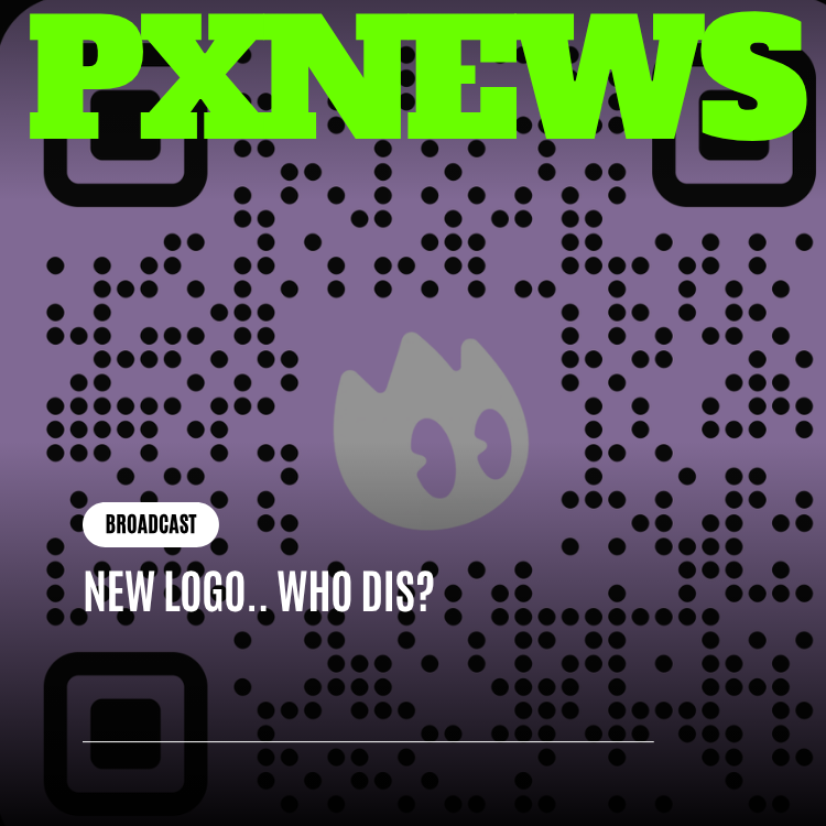
Okay, deep breath, because this one's been sitting in the group chat for a minute: ETAPX has a new logo. Not a filter, not a seasonal profile picture, not an April Fools bit that goes back to normal on the second — an actual, permanent, we-mean-it new visual identity for ETAPX and Whistlr, rolling out across the app, the site, the socials, and yes, the merch. If you opened your phone this week and did a double take at the app icon, that was the point. New logo, who dis? That's the whole announcement, honestly, but you clicked in for details, so let's give you all of them.
This is the reveal post — the "here's what it looks like and why it feels different" piece. If you want the long, thoughtful, strategy-memo version of why ETAPX decided a rebrand was even necessary in the first place, that conversation lives in a companion piece over here, and it gets into the weeds. This one is about the mark itself: what changed, what it looks like, where you'll start seeing it, and what people are already saying now that the reveal is live.
So What Actually Changed With the New Logo?
Let's start with the obvious question, because everyone's asking it: what did ETAPX actually do to the logo? The short answer is that the new logo is tighter, cleaner, and considerably more confident than what came before. The old mark did its job — it got Whistlr off the ground, it was recognizable, it showed up on a lot of phone screens — but it was built for a company that was, frankly, a much smaller and much younger version of what ETAPX is today. The new identity is built for the company ETAPX actually is right now: a multi-product, multi-audience organization with real range.
Visually, the shift is best described as a move from "startup sketch" to "established mark." The geometry has been simplified — fewer competing shapes, a silhouette that reads clearly even when it's the size of a thumbnail. The linework feels more deliberate, like every curve was actually decided on instead of just landed on. There's a sense of weight and stability to the new logo that the old one, charming as it was, never quite had. It looks like something that's been around, even though it just showed up.
Color-wise, the new palette leans into a more grown-up confidence without losing the energy that made Whistlr feel like Whistlr in the first place. Think less "look at us, we're loud," more "we don't have to yell, you already know who we are." That's a vibe shift as much as a color shift, and it's very much intentional.
The Feeling ETAPX Was Chasing
Every design team will tell you a rebrand starts with a mood board and ends with a headache, but somewhere in between there's usually a single feeling the whole thing is chasing. For this one, the north star was "confident, not corporate." ETAPX didn't want a logo that felt like it belonged to a bank. It wanted a logo that felt like it belonged to a company that has actually shipped things — Whistlr, GLSRM, Ocsidian, Influxx — and has the track record to back up a little bit of swagger.
There's also a practical feeling baked in here: legibility. The new logo was stress-tested at tiny sizes — app icon size, favicon size, the size your logo actually lives at most of the day even though nobody designs for that first. If a mark only looks good on a poster, it's not doing its job. This one was built to hold up in a notification badge just as well as it holds up on a banner.
New Logo, New Whistlr Family Energy
Here's the part that matters more than it might seem at first glance: this isn't just a Whistlr logo update. It's an ETAPX identity update, and Whistlr is the flagship, most-visible piece of a family that's grown a lot since the original branding was drawn up. When the first Whistlr mark was designed, there was one product. Today there are four: Whistlr, GLSRM, Ocsidian, and Influxx. That's not a rounding error — that's an entirely different company shape, and the old visual identity was never built to stretch across that many surfaces.
Think about what it actually means for a brand to cover that much ground. Whistlr is the social platform where most people meet ETAPX for the first time. GLSRM operates in its own lane with its own audience. Ocsidian and Influxx serve builders and creators who care about entirely different things than the average Whistlr user scrolling their feed on a Tuesday night. A single visual identity has to flex across all of that without losing what makes it recognizable — and without making any one product feel like the "real" one while the others feel bolted on.
That's the actual design brief behind the new logo, even if the reveal itself is the fun part: build a family resemblance. Not a rigid uniform where every product looks identical, but something more like siblings — you can tell they're related the second you see them side by side, even before you read the name.
- One family, four faces: Whistlr, GLSRM, Ocsidian, and Influxx now share a visual DNA — consistent shape language, consistent logic — while each keeps its own identity within that system.
- Built to scale, not just to launch: the new identity was designed with room for future products in mind, so ETAPX isn't back at the drawing board the next time it ships something new.
- Legible at any size: from a notification badge to a merch drop to a conference banner, the new logo holds its shape instead of turning into a smudge.
- Theme-flexible: the mark was designed to hold up cleanly across light backgrounds, dark backgrounds, and everything in between, instead of just looking right in one context and awkward in every other one.
- Confident, not corporate: the goal was a logo that feels like a company that has actually shipped things, not a logo copy-pasted from a generic tech template.
The "Wait, Who Is This?" Moment — And Then Recognition
Let's be honest about the actual experience of a logo reveal, because it's a very specific kind of chaos. For about the first ten minutes after something like this goes live, a chunk of the internet genuinely does not know what they're looking at. That's not a failure — it's basically the tax you pay for changing something people have looked at every single day. The "new logo, who dis?" framing isn't just a cute title, it's a pretty accurate description of what actually happens in a group chat when someone posts a screenshot of their home screen and goes "wait did Whistlr get hacked or something."
And then, almost immediately after the confusion, the recognition kicks in. That's the moment ETAPX's design team was actually building toward — not the double take itself, but what happens right after it. You squint, you read the name, and suddenly the pieces click: oh, it's still them, it just looks like they leveled up. That's the emotional arc a good rebrand reveal is supposed to produce, and based on the first wave of reactions, it landed pretty much exactly like that.
What People Actually Said
The reactions started rolling in within minutes of the new app icon showing up on people's home screens, and they broke down into a few predictable camps. There was the initial confusion camp — people genuinely wondering if their phone glitched or if they'd accidentally downloaded a knockoff app. There was the "wait, this actually goes hard" camp, who scrolled through the new site and merch mockups and came around fast. And there was a smaller but very vocal camp of design nerds picking apart the geometry line by line, which, respectfully, is exactly the kind of attention a rebrand hopes to get.
"I've had Whistlr on my phone since basically the beginning, so when the icon changed overnight I genuinely thought I'd gotten phished. I texted my friend a screenshot like 'is this real??' Five minutes later I'm looking at the new site and I'm just sitting here like... okay, this actually looks like a real company now. Who dis, indeed. But also, welcome, I guess."
— Priya Anand, longtime Whistlr user
That reaction — the confusion-to-approval pipeline — showed up over and over in the first wave of comments and posts. A few people were more resistant, which is normal and honestly expected any time you touch something people have muscle memory for. Change your app icon and someone, somewhere, is going to say "bring back the old one" within the hour, purely on principle. But the overall tone tilted very quickly toward genuine enthusiasm once people had a minute to actually look at the new mark instead of just reacting to it being different.
Where You'll Actually See the New Logo
A logo reveal isn't a single moment, it's a rollout, and ETAPX wanted this one to feel cohesive rather than scattered — no world where your app icon updates but the website still looks like it's stuck in a previous era for three weeks. Here's where the new identity is showing up, roughly in the order people are noticing it.
App Icon and In-App Branding
This is ground zero for most people, and it's exactly why the reaction has been so immediate and so loud — your app icon lives on your home screen, you see it dozens of times a day, and changing it is about as high-visibility as a rebrand gets. The Whistlr app icon has been updated to the new mark, and the identity carries through into the app itself: splash screens, loading states, in-app iconography, and the little visual touches that make the product feel like one coherent thing rather than a UI wearing a new logo like a costume.
The Website
The ETAPX site has been refreshed to match — new logo treatment across the header, footer, favicon, and every touchpoint where the old mark used to live. This matters more than it sounds like it should, because a mismatched brand across app and website is one of the fastest ways to make a company feel less trustworthy, even if nothing about the actual product changed. Consistency here isn't decoration, it's credibility.
Merch
Yes, the merch is getting the update too, and honestly this might be the part people are most excited about. There's something different about seeing a brand refresh on a hoodie or a hat versus just on a screen — it makes the new identity feel real in a way that pixels alone don't quite manage. Expect the new logo across upcoming merch drops, with existing designs phasing over as new stock rolls in.
Social Media
Profile pictures, banners, post templates, the whole social presence across every platform ETAPX shows up on — all getting the new treatment. This is also, unsurprisingly, where most of the "wait, who is this" reaction moment actually happened, since a changed profile picture is one of those things that shows up in your feed whether you were looking for it or not.
Everywhere Else
Email templates, support documentation, partner materials, the works — the rollout is designed to reach every corner of how ETAPX shows up publicly, not just the flashy, high-visibility spots. A brand refresh that only lives on the app icon and forgets about the email footer is a brand refresh that's only half done, and ETAPX wanted this one to actually be finished.
"We didn't want people to see the new logo on the app icon and then run into the old one somewhere else three weeks later — that's the fastest way to make a rebrand feel unfinished. The goal was for the identity to show up everywhere at once, so the moment people had was one clean, unmistakable reveal instead of a slow, confusing drip."
— Renee Castillo, Head of Brand, ETAPX
Why Now? (The Short Version)
We promised to keep the deep strategic reasoning brief here — that's what the companion piece is for — but it's worth touching the basics, because "why now" is one of the first questions everyone asks after "wait, what happened to the logo."
The simplest version: ETAPX has changed a lot since the original branding was locked in, and the visual identity needed to catch up. What started as a single social product has grown into a genuine family — Whistlr, GLSRM, Ocsidian, Influxx — each with its own audience and its own reason for existing, but all under one roof. A logo built for a single scrappy app was never going to comfortably represent that. At some point, the visual identity has to grow up alongside the company wearing it, or the gap between how ETAPX looks and what ETAPX actually is just keeps widening.
There's also a simpler, more human reason: the old logo had done its job. It got people's attention, it built recognition, it carried the brand through its earliest and scrappiest days. But brands, like people, evolve — and eventually the version of you from a few years ago stops looking like the version of you standing here now. This is that moment for ETAPX, visually speaking. If you want the full strategic story — market positioning, long-term thinking, the actual "why" behind the "why now" — that's the deep-dive companion article, and it's worth the read. This piece is about the reveal.
What Doesn't Change
Amid all the "wait who is this" energy, it's worth being direct about what a visual refresh does not touch: the actual experience of using Whistlr, GLSRM, Ocsidian, or Influxx. Your account, your data, your circles, your streams, your Gems, your feed — none of that moves. This is a coat of paint on a house you already live in, not a renovation of the foundation. The logo looking sharper doesn't mean the app underneath works any differently on day one; it just means the front door finally matches how nice the inside actually is.
That distinction matters because rebrand announcements can sometimes read like bigger news than they are, and ETAPX wants to be upfront: this is a brand and design update, full stop. Feature changes, product updates, and everything else continue on their own timelines, announced on their own terms, same as always.
The Reactions, In Full
Since the reveal went live, the response has genuinely been one of the more entertaining threads to watch unfold in real time. There's a real arc to it — confusion, then curiosity, then a kind of grudging or enthusiastic approval depending on how attached someone was to the old look. A few longtime users posted side-by-side comparisons of the old and new marks, which, love it or hate it, is exactly the kind of engagement a reveal hopes to generate. Debate is proof people care.
What's been especially fun to watch is how quickly the "who dis" jokes turned into genuine appreciation posts once people scrolled past the initial shock and actually looked at the site, the app, and the early merch mockups together as a system rather than a single isolated change. A rebrand rarely wins people over with the first screenshot — it wins them over once they see the whole picture working together, and that's exactly the shift that's been happening this week.
There's also been a smaller, quieter reaction worth mentioning: relief, from people who were half-expecting a total reinvention and instead found something that still unmistakably feels like ETAPX and Whistlr, just sharper. That's arguably the hardest needle to thread in any rebrand — different enough to notice, familiar enough that nobody feels like they've lost the thing they liked in the first place.
What Happens Next
The rollout continues over the coming weeks as remaining surfaces catch up to the new identity — think older marketing pages, partner-facing materials, and any lingering assets that haven't been swapped over yet. If you spot an old logo somewhere in the wild during this window, that's not a mistake so much as a to-do list item; the goal is full consistency everywhere ETAPX shows up, and that takes a little time to finish properly rather than rushing it and leaving gaps.
Beyond the logistics, this reveal is really just the visible tip of a broader identity system that ETAPX's design team has been building — one meant to give every current and future product room to feel like part of the same family without losing what makes each one distinct. Whistlr got the spotlight this week because it's the most visible product, but expect the same visual language to show up across GLSRM, Ocsidian, and Influxx as their own touchpoints update on their own timelines.
Frequently Asked Questions
Why did ETAPX change its logo?
ETAPX has grown from a single product into a family of them — Whistlr, GLSRM, Ocsidian, and Influxx — and the original visual identity was built for a much smaller, single-product company. The new logo reflects who ETAPX actually is today: a broader ecosystem that needs an identity flexible enough to represent every product under one recognizable family look. For the full strategic reasoning behind the timing, the companion deep-dive article covers that in detail.
Is the new logo just for Whistlr, or all of ETAPX?
It's an ETAPX-wide identity update, not a Whistlr-only change. Whistlr is getting the spotlight first since it's the most visible, most-used product in the family, but the same visual system and family resemblance extends across GLSRM, Ocsidian, and Influxx as those products update their own touchpoints.
Where will I actually see the new logo?
Basically everywhere ETAPX shows up: the app icon and in-app branding, the ETAPX website, social media profiles and banners, upcoming merch drops, and email and partner materials. The rollout is designed to reach every surface rather than leaving the new logo stranded on just the app icon while everything else looks outdated.
Does the new logo mean the app or features are changing too?
No — this is a visual and brand identity update, not a product overhaul. Your account, data, circles, feed, streams, and everything else about how Whistlr, GLSRM, Ocsidian, and Influxx work stays exactly as it was. Feature updates continue on their own separate timelines and will be announced on their own terms, same as always.
Will old versions of the logo still show up anywhere?
Possibly, briefly. A rollout this broad — app, web, social, merch, email, partner materials — takes a little time to fully complete everywhere. If you spot an old-style logo somewhere in the coming weeks, it's a leftover on the update list rather than an intentional mixed identity, and it'll get swapped over as the rollout finishes.
And that's the reveal. New logo, same ETAPX and Whistlr underneath, now looking like the company it's actually grown into. Who dis? Just us, upgraded.